END-TO-END // STUDENT PROJECT
Supporting an Underserved Audience
C L I E N T
CareerFoundry
R O L E
UX Researcher & Designer
T O O L S
Figma // Lucidchart // UsabilityHub // Zoom // Google Drive
Second Spring is an app that enables users to effortlessly monitor, analyze and understand the symptoms and care-options of perimenopause and menopause. It aims to increase empowerment, self-advocacy, and connection among people in this phase of life.
I was the sole researcher and designer and conducted all aspects of the project, from conceptualization, research, design, prototyping and testing. I produced a project brief, which included a SWOT analysis, identified market risks & opportunities, and outlined project phases & timeline. I conducted interviews & surveys, card sorting, evaluative & generative testing, and more. I wireframed, designed, and prototyped all screens. And I prepared files for developer handoff.
Explore the Prototype
The Problem
More than 1 million people in the US experience menopause each year, with an estimated 6,000 entering this naturally-occurring phase of life every day. Yet there is little to no education about menopausal symptoms and treatments—for the individuals experiencing it or the health care providers charged with supporting them. This gap in knowledge creates unnecessary and reducible suffering for millions. For gender nonconforming people with ovaries, lack of information, community and knowledgeable care providers is even more acute.
The Process
Empathize
Desk Research
I sought to learn as much as I could from existing information about needs and desires of people in menopause, the supports that currently exist, and the gaps in those supports.
Competitive Analysis
I did a thorough analysis and SWOT of the two most popular menopause-focused apps, Caria & Balance. I identified key market opportunities my app could meet: (1) improved usability and (2) gender inclusivity.
Interviews & Surveys
I created and distributed a survey using Google Forms. I received 28 responses, and I used that information to inform User Interviews. I conducted 3 hour-long moderated interviews and derived key insights that guided the design of the app.
Key Empathy Insights
-
All interviewees expressed feeling overwhelmed by menopause, unsure how to make sense of the experience, and uncertain whether anything can be done to alleviate their symptoms. They all expressed frustration with feeling so uninformed about the process and symptoms of menopause, noting that they feel proactive and empowered in other areas of their lives and other aspects of their health. Their desperation validated the need for this app and inspired me to stay focused.
-
In the survey, respondents reported seeking information about symptom relief from their friends (73%) at nearly the same rate as they seek it from medical professionals (76%). For this reason, I prioritized the inclusion of a community forum as a key feature. Enabling peer interaction becomes very important.
-
When I began, I assumed the primary symptoms people would seek relief from was insomnia. I thought a feature that offered guided meditations for insomnia and anxiety would be one of the most useful features I could include. However, only one survey respondent said they desired or would use guided meditations for sleep or anxiety. Instead, 73% of respondents said access to local practitioners who specialize in supporting people in menopause was what they most desired. This changed my direction, and I focused on enabling provider searches and contact.
-
Interviews and surveys revealed this demographic feels extremely busy and overwhelmed by the often competing demands of career-care and dependent-care. Their own health and self-care is a low priority, although they want it to be higher. Therefore, it became essential to build this tool in a way that made it extremely simple and pleasant to use. It had to inform without further overwhelming. It had to deliver value with minimal effort from the user.
Define & Ideate
Creating Personas
Based on the unique needs and desires discovered through the research, I devised two primary personas. I created a third persona to represent the perspective of a trans man.
User Flows & Journey Maps
I created user flows and customer journey maps for specific scenarios related to each persona. These informed the initial features & site map.
Mobile First Priorities
I performed a content audit a competitor app and established features and flows I would (and would not) emulate. I also established how the feature set would change from mobile to desktop versions.
Site Map & Card Sort
I generated a first draft of a site-map, and I tested my map by performing an online card sort. I chose a hybrid sort because I anticipated a small sample size, yet I wanted to give room for suggestions. I made changes to the site map based on insights gleaned from the card sort.
Prototype & Test
Wireframes & Prototypes
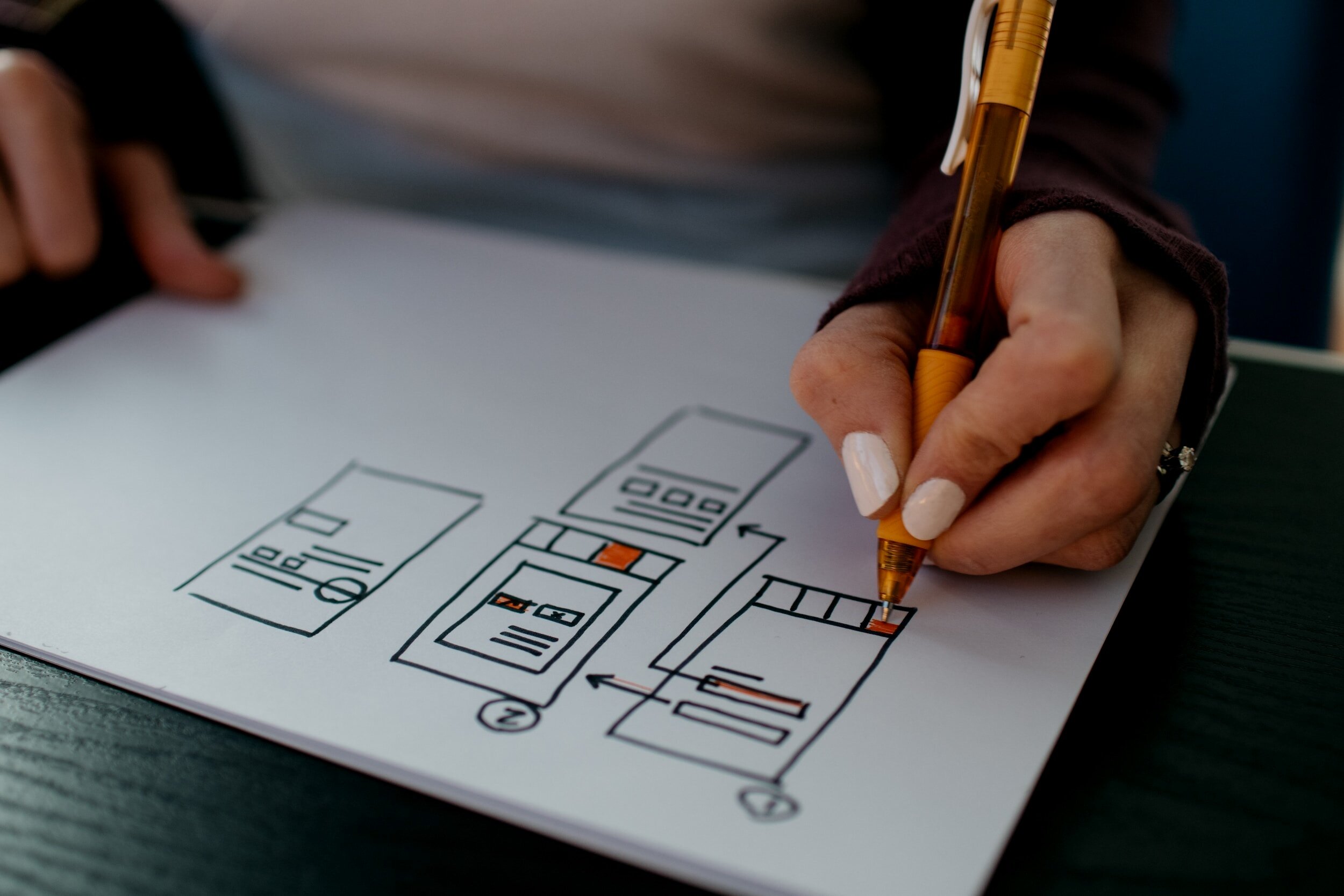
I used pen and paper to generate fast, basic sketches of the app’s core features for mobile and desktop, as well as the on-boarding screens. I created mid-fidelity wireframes using Keynote. For high-fidelity wireframes and a clickable prototype ready for user testing, I turned to Figma.
Usability Testing
I created a Test Plan and Moderator’s Guide for in-person and remote usability testing. I recruited participants and conducted six successful usability tests to find errors and usability issues. I also conducted A/B testing to inform design of the onboarding screens. I received 14 responses from three countries and incorporated the feedback into the app’s design.
Analysis & Reporting
For the usability tests, objectives were assessed using Jakob Nielson’s error rating scale and the Subjective Mental Effort Questionnaire (SMEQ). I analyzed the results of testing using Tomer Sharon’s Rainbow Spreadsheet method. I identified the most salient and pressing issues, proposed solutions and made changes to the design. I produced a detailed report to convey the results, suggestions, rationale and next steps.

Advice for My Future Self
-
Put pen to paper and start sketching ideas as early as possible. It’s amazing how much can be uncovered by simply giving shape to the ideas stewing in your head.
-
I gave some of my early hypotheses a test-run in a survey, and wow, I learned I was wrong about the features I thought users wanted. That early check was essential to ensure I didn’t build the app around the wrong features.
-
As the project progresses and the design evolves, it can be hard to stay focused on your users most pressing needs & desires. Keep the personas close in order to ensure their needs are always guiding your design.
-
I’m in love with Figma. It’s a generous community, and there are so many resources for learning. I’m especially grateful to my tutor Danielle Johnson for introducing me to Figma Decal, a free and well-organized video series for anyone who wants to get started with this tool.